Overview
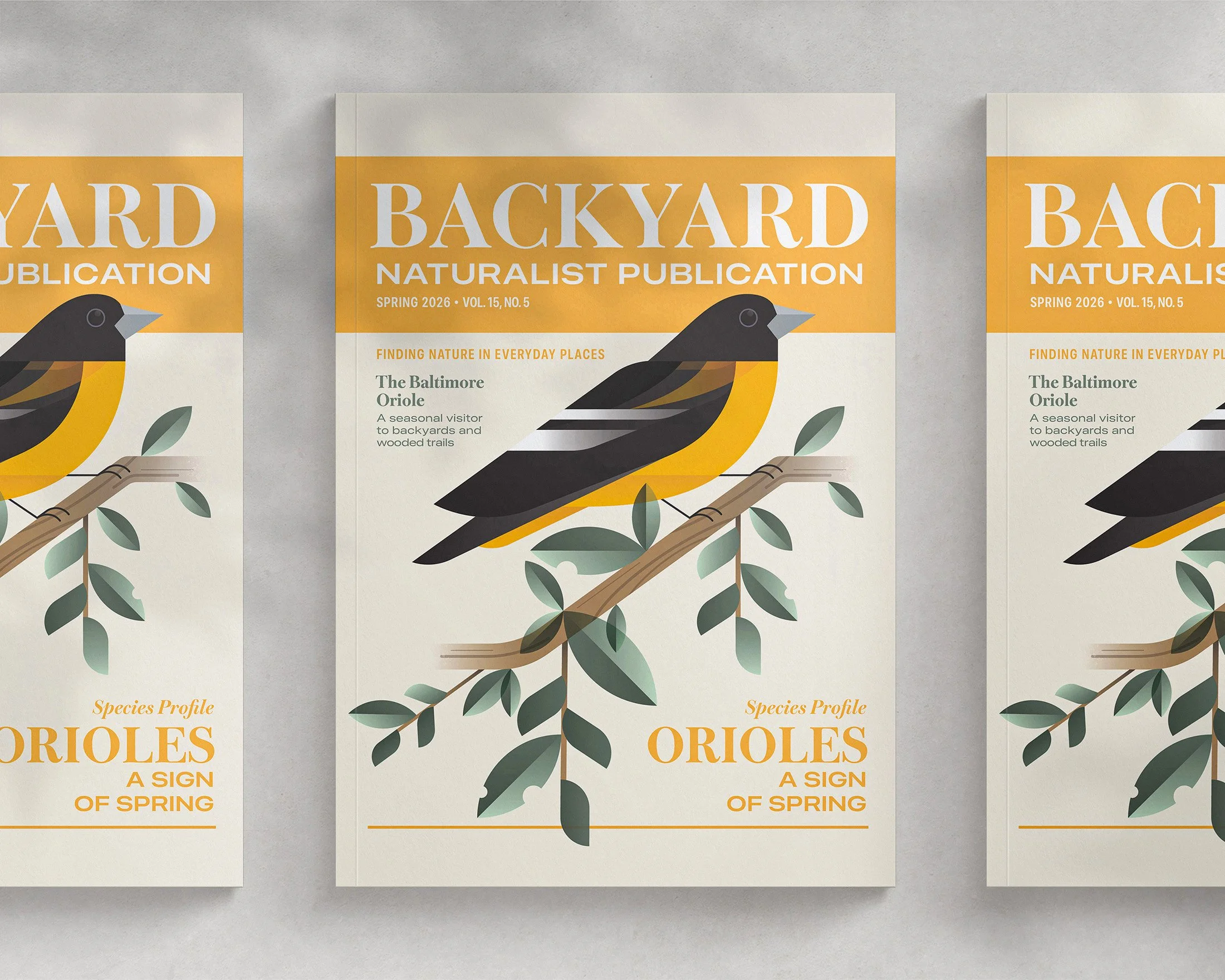
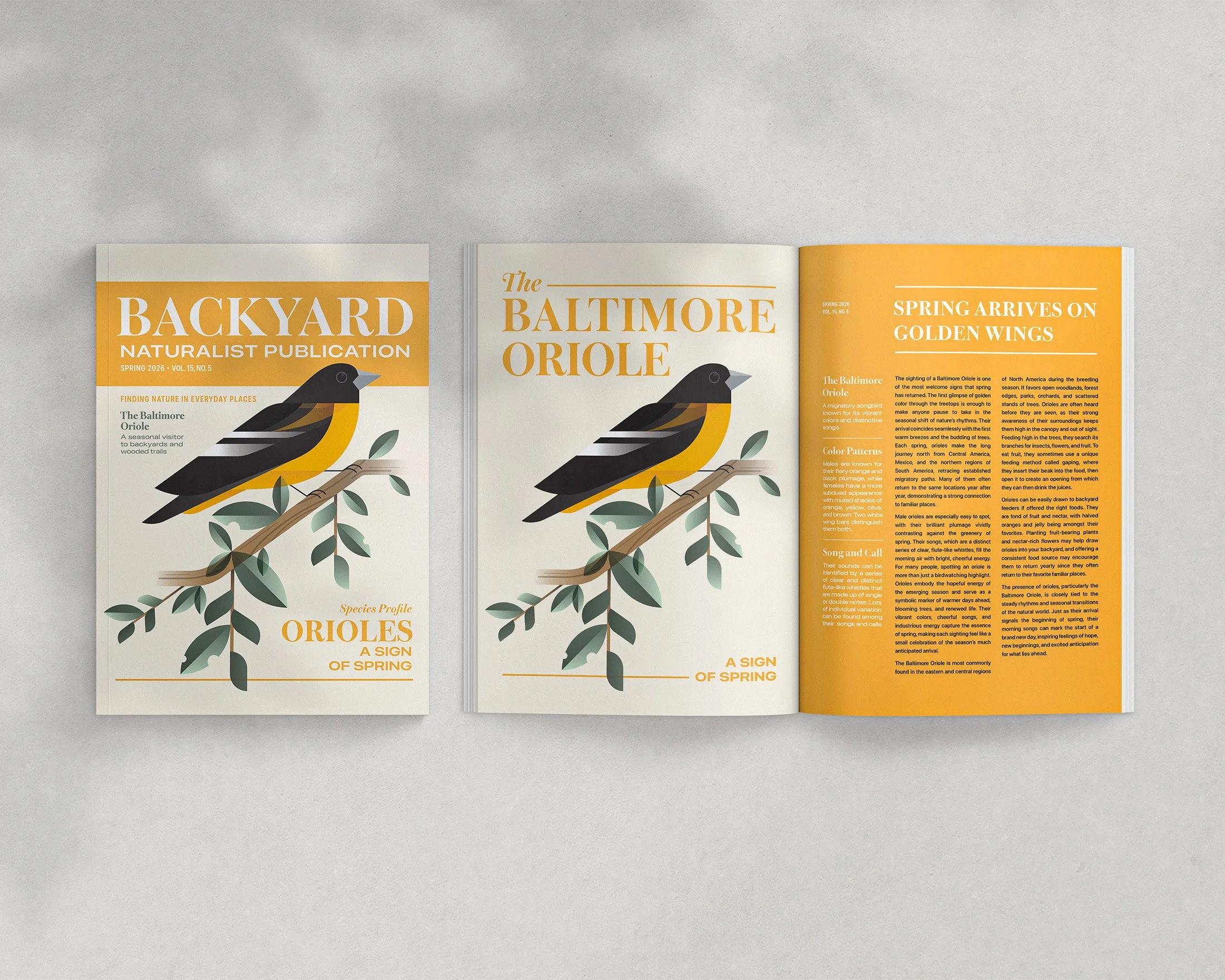
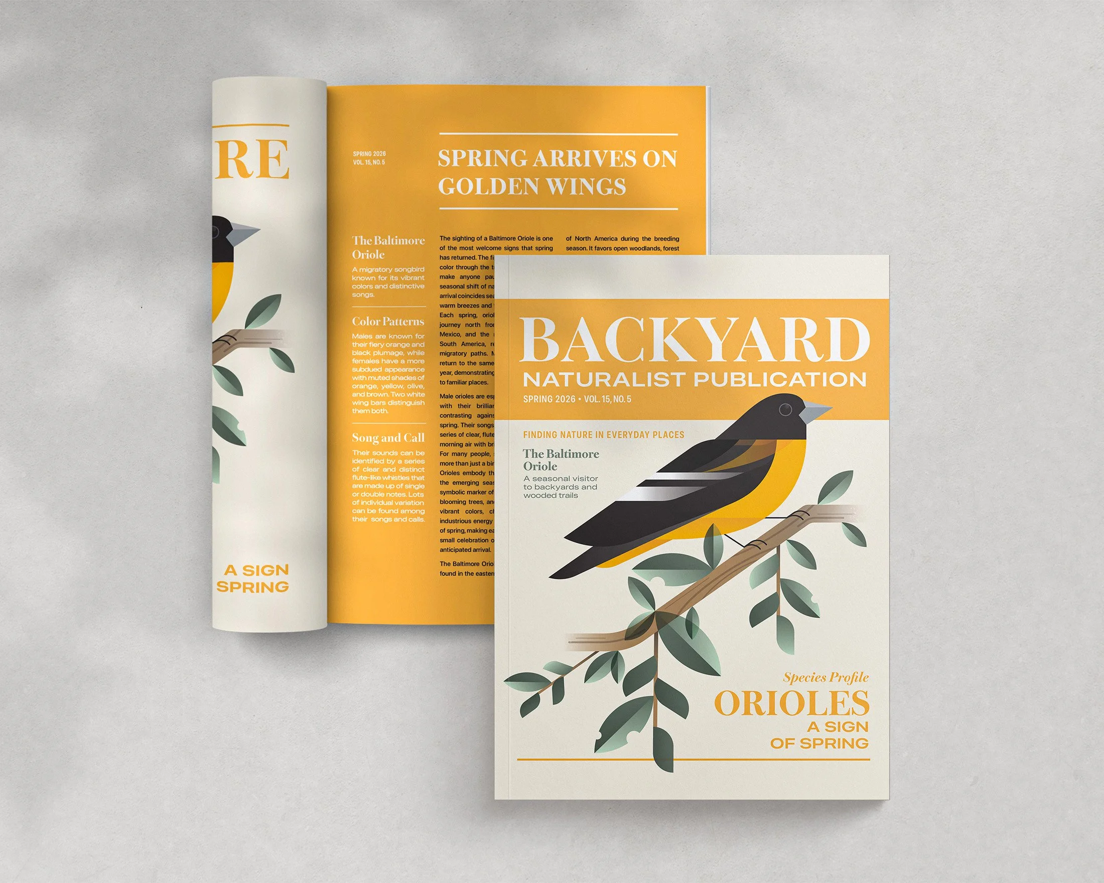
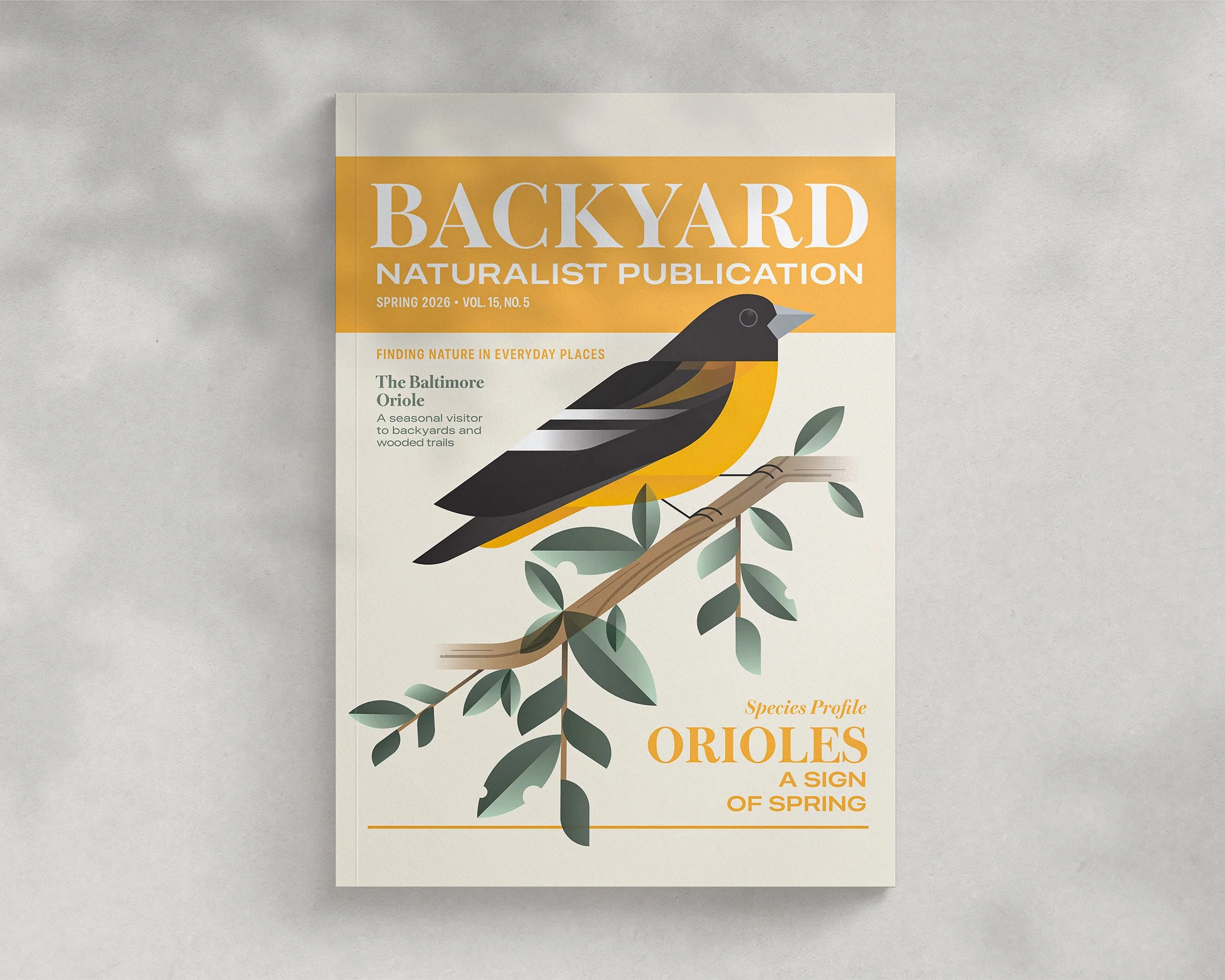
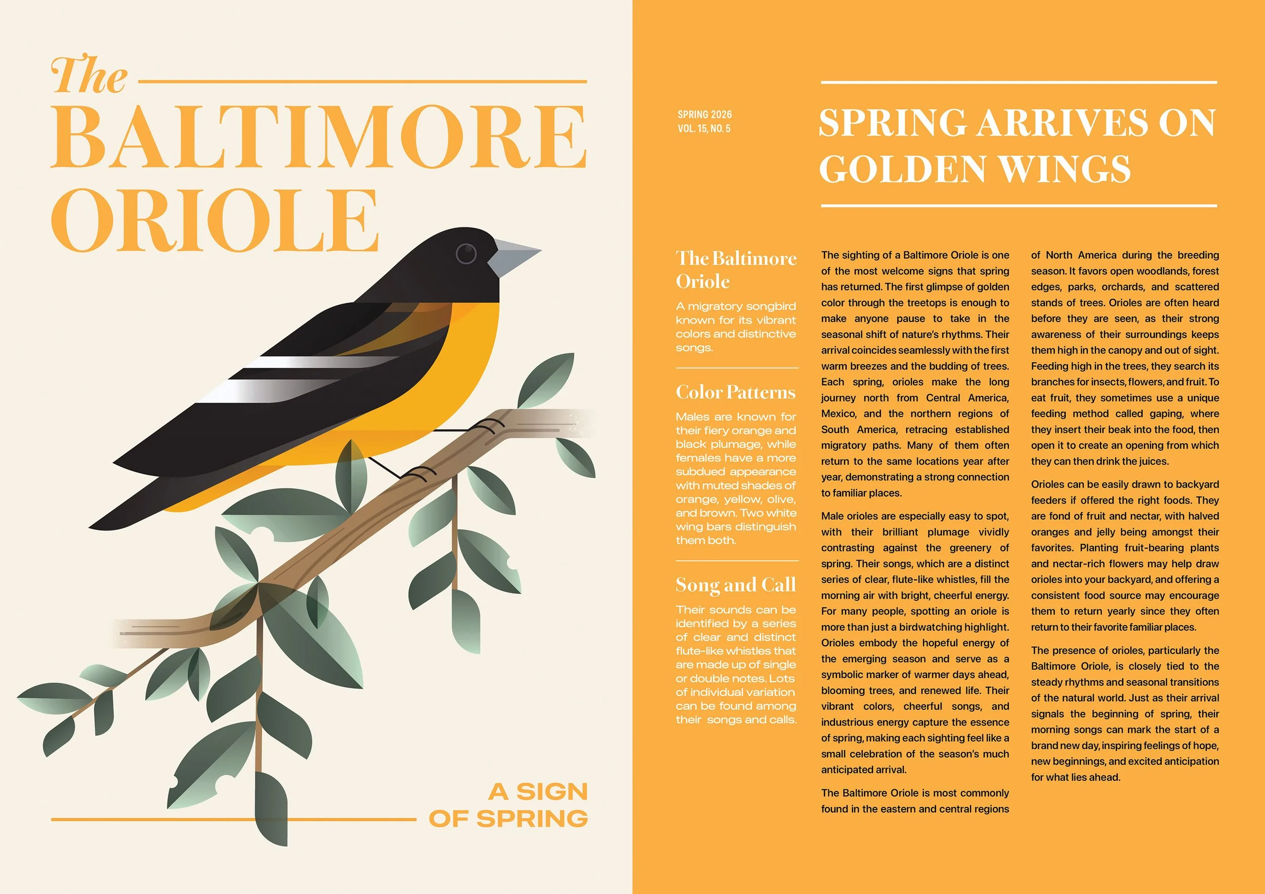
An editorial design piece exploring the integrated relationship between text, image, and layout within a print feature. Highlighting the Baltimore Oriole species and its symbolic connection to the arrival of the spring season, the project combines the aesthetics of visual storytelling with the functional role of layout in editorial design.
Design Process
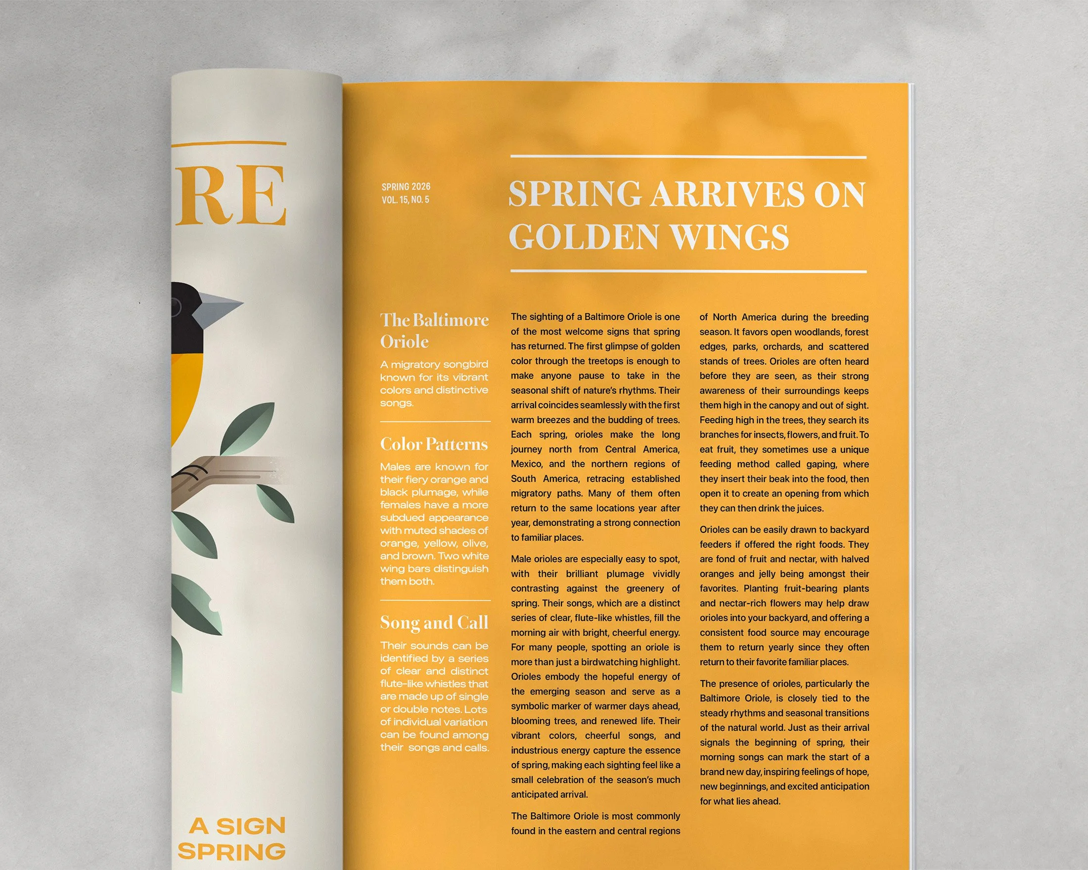
This project focused on developing a cohesive editorial system across a magazine cover and interior two-page spread. Visual structure and elements from the cover were carried into the interior pages, creating continuity across the publication, while the two-page spread was designed as a unified composition that balances both text and image in a harmonious way. Color, composition, and visual pacing all work together to help guide the reader through the content. Golden tones referenced from the oriole’s colors reinforce the theme of the warm emergence of spring, supporting both the visual narrative of the piece and the functional delivery of the editorial content.